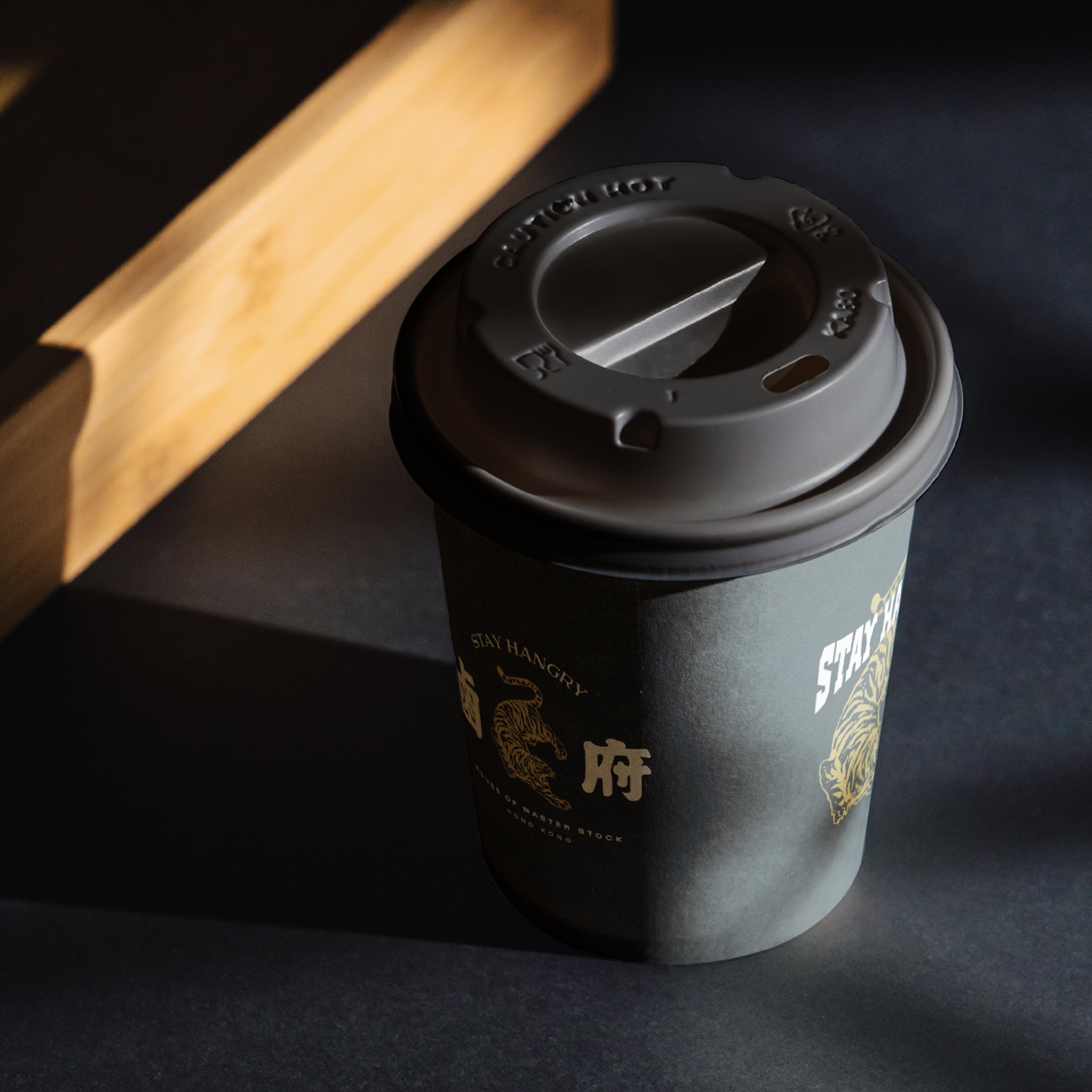
The tiger that brings east and west together
LO FU
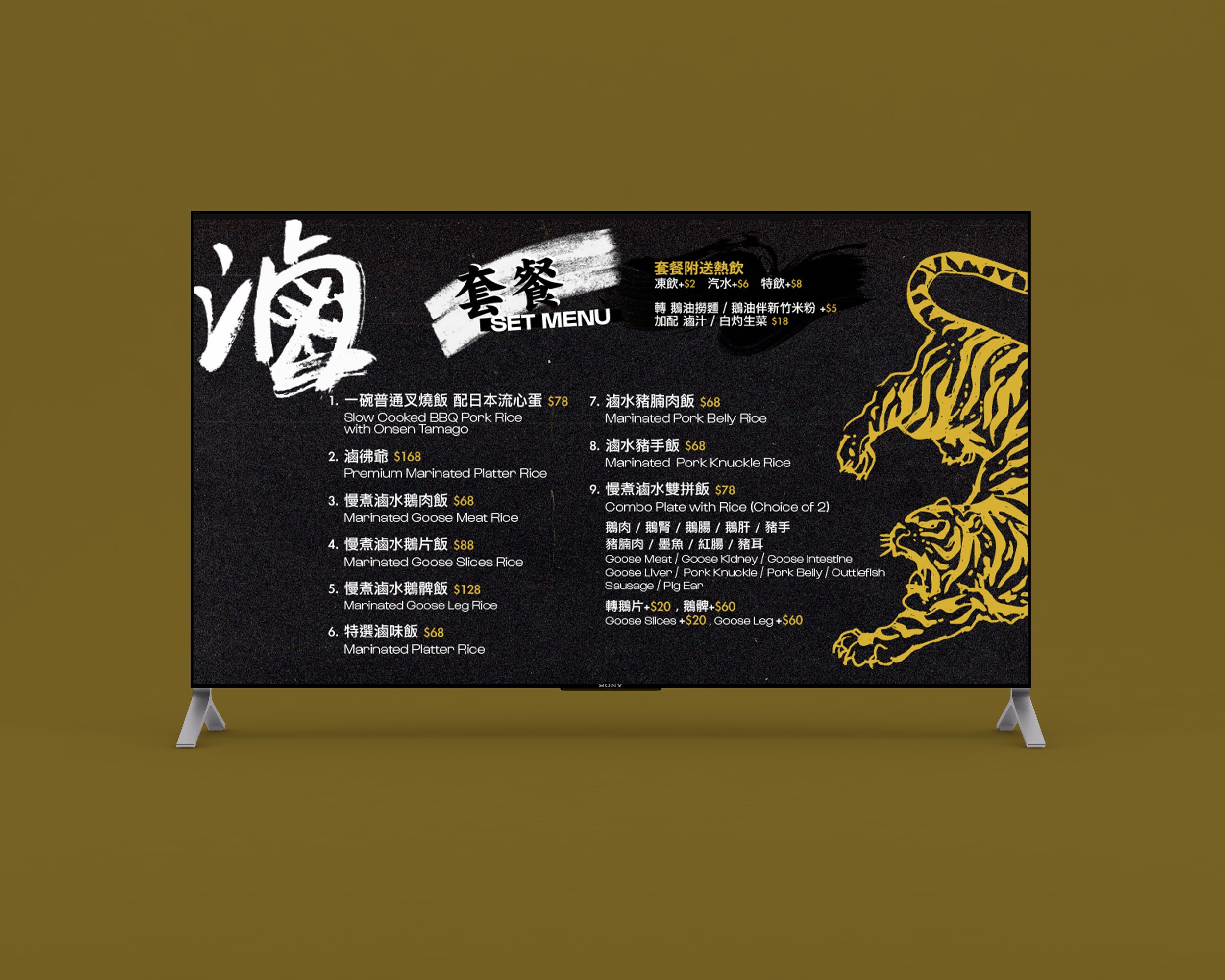
Brand Identity, Packaging, Illustration, Menu Graphics & Layout, and Interior Graphics

滷府 (Pronunciation: LO FU) is a restaurant that situates in Quarry Bay, Hong Kong. The name is a play on word, which means “House of Master Stock”, while the pronunciation also means “Tigers”. Our client asked for a mix of traditional Chinese and timeless modern design style to complement this new fusion style of marinated meal.
We chose the colour gold to go with the tiger, while also complementing the wood.


SEE SIMILAR PROJECTS


